Rating
What is a Rating input control?
A rating input is a type of input control that allows users to evaluate and select a score from a predefined range of whole numbers. This input allows users to interact visually, typically represented by stars or other icons.
For example: Imagine you are creating a form which the users can use to indicate their level of satisfaction with a service, say 4 out of 5 stars.

In a rating element a set icon appears for a defined whole number count. This forms the maximum possible value of the element. The value of the element (by user input or default) is depicted by the number of bold icons.
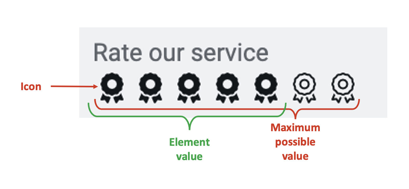
Selecting a value in the Rating element is like typing that value in a whole number element. For instance, if the user selects 3 stars out of 5, the rating element will store the value as 3.
What are the attributes for rating control?
Consider the following image and corresponding list sequentially explaining the fields of the attributes section for rating control.
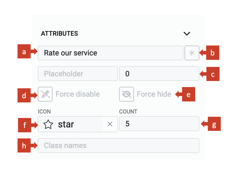
a. Label - This field allows you to type the label to the rating control. The label shall appear above the element in the Adaptive Document and is used to provide context for the user.
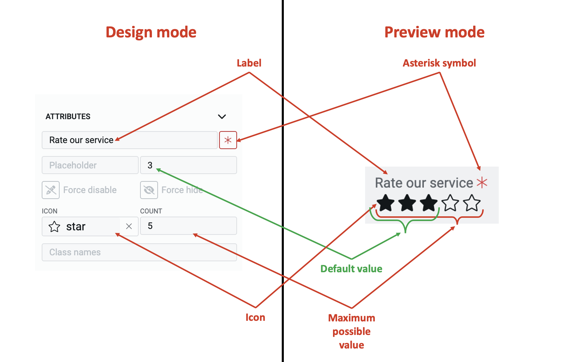
b. Asterisk (*) sign - If you click ON this field, then an asterisk sign will appear next to the label. This is used to indicate a special message to the users of the document. For example - conditions apply, the element is mandatory etc.
It is important to note that the Asterisk sign is only a visual indicator and does not imply any logical condition on the control. For example - turning the Asterisk sign as ON will not make the toggle control a mandatory element for users. All logical behaviour for the control should be configured using conditions and validations.
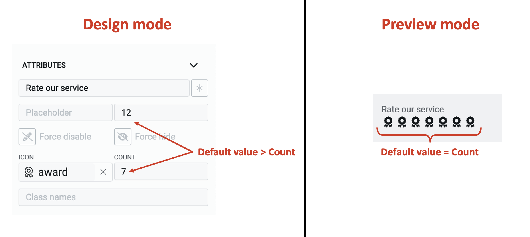
c. Default value - You can set the default value for the rating element here.
If the user inputs a value to the element, then the default value will be replaced by the user entered value. If the user does not interact with the element, then the default value will be submitted as element value.
A default value may be useful when you feel most users will fill out the same value, however, you still want to give them a flexibility to change the value of the element. For example - You may want to set the default value of rating for service satisfaction to 5. If the user does not interact with the rating element, then the system will take the value of satisfaction as 5. However, the user has the flexibility to input another rating value, and change it from default value.
d. Force disable - If this field is clicked ON, then it will supersede all enable conditions and the element will always remain in disabled mode.
This is useful when you want to display a dynamic piece of information to the users. For example - Imagine a student has given a rating with reference to the learning experience in a Professor's class. This information is displayed to the Professor but the Professor is not allowed to alter the rating.
e. Force hide - If this field is clicked ON, then it will supersede all show conditions and the element will always remain hidden from the user.
This feature can be used in advanced Adaptive Documents, where you need to pass a certain value, but do not want to show it to the user. For instance, consider a 360 degree performance review of an employee. While the employee fills in the achievements over the period, the rating given by the peers is kept hidden from the employee.
f. Set icon
You can define the icon that is used to depict rating. To set the icon consider the following steps:
- Click on this field.
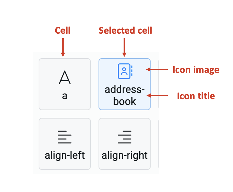
- The icon picker will open. The icon picker has a list of 1389 icons.
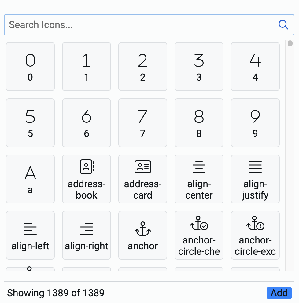
Each cell represents an icon with the icon image displayed on top and its title display below it.
-
You can search for the icon from the search icons bar. The system matches the typed keyword with the icon title and displays all the icon cells that match.
-
Select an icon by clicking on the cell. The selected cell is highlighted in blue. Please note, you can select one and only one cell.
-
Click Add at the bottom right corner of the icon picker.
g. Count - This field allows you to type in the whole number value, which becomes the maximum possible value for the element.
In case you set the default value > the Count value, then the element will display the count as default value.
h. Class names - In this field, you can type the name of the CSS class and the element will be styled as per the CSS class definition.